Rare Earth Industry Association Rebrand
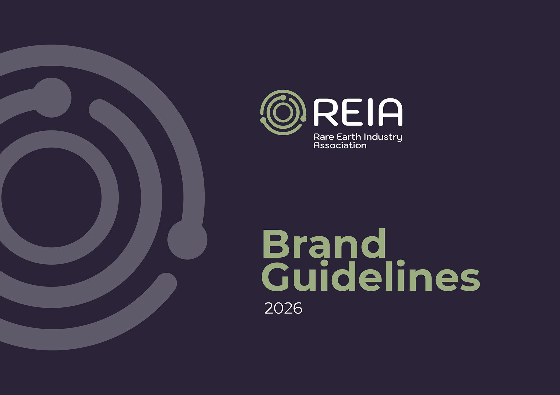
For this project, I worked on refreshing the brand identity for a rare earth industry association, with the goal of creating a cleaner, more modern, and professional visual presence while still reflecting the organisation’s expertise and industry heritage.
The existing logo was carefully reviewed and simplified, stripping back unnecessary elements to create a more refined and memorable design. A complementary typeface was introduced to give the brand a contemporary feel while maintaining a sense of trust and authority.
A key part of the rebrand was developing a considered colour palette inspired by the rare earth minerals themselves. Research into the natural colours and characteristics of these materials helped create a unique and harmonious palette, combining these tones with a strong dark blue foundation to represent professionalism, knowledge, and credibility.
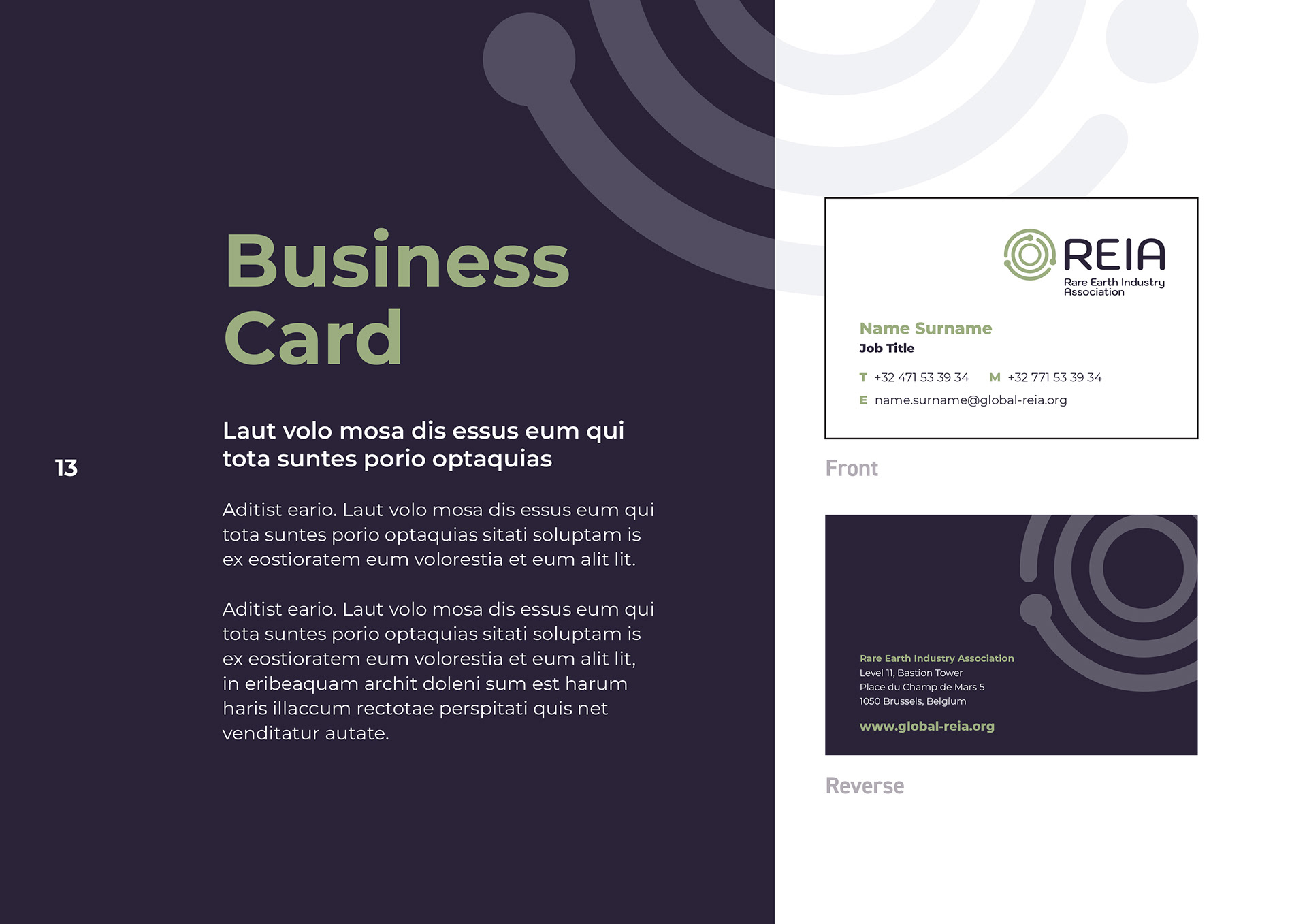
Following the new brand direction, I developed a comprehensive brand guidelines document to ensure consistency across all future communications. I also designed a range of supporting brand collateral, including business cards, email signatures, event name badges, and roller banner stands, creating a complete and cohesive identity across both digital and physical touchpoints.
The final rebrand provides the association with a modern, confident, and recognisable identity that reflects its position within the rare earth industry.